Storybook
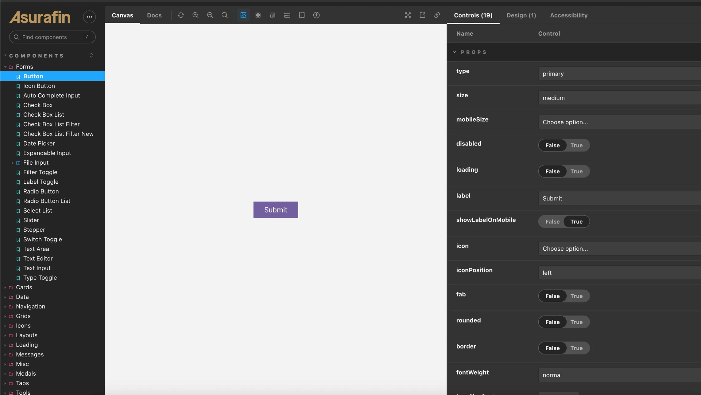
Asurafin's Storybook component library
01 / Overview
As the lead developer tasked with revolutionising our company's frontend development approach, I led the implementation of Storybook to create a cohesive and efficient development environment. This strategic development not only optimized our frontend workflow but also ensured consistency and reusability of components across all digital platforms, significantly enhancing our UI/UX design efficiency.
Frontend: By harnessing the capabilities of Storybook alongside Nuxt, Vue, and Tailwind CSS, I constructed a comprehensive component library that centralised the design and functionality of UI elements
Portals: Used across various Asurafin portals, including the Advisor Portal, Client Portal, Research Portal, PMS Portal, and Ops Portal
npm: This library was deployed as a private npm package, utilising yalc for streamlined local development processes
DevOps: To ensure continuous integration and deployment, the library was also deployed onto a private Chromatic account via GitHub actions
- Portals built on it
- 5
02 / Problem
Asurafin was building several client and internal portals, and without a shared library each one would end up re-creating the same UI components.
03 / Decisions
04 / Outcome
The Advisor, Client, Research, PMS and Ops portals all use it, so they share the same components and look.
05 / Stack
- NuxtFrontend
- StorybookFrontend
- ChromaticDevOps
- TailwindFrontend
- TypeScriptFrontend
- VueFrontend
- GitHub ActionsDevOps